If You Haven’t Done This Website Design Modification, You Need To Soon!
Brett from the Niche Laboratory niche research tool here.
In this post I’ll show you why you need to look at whether your website is MOBILE FRIENDLY.
Why?
Because PC’s and MacBooks and other devices are dying!
If your website is not mobile friendly, then you’re potentially missing out on traffic. More importantly, you might be making it a lot harder for users to use your site! I know that I personally have given up on a few sites that are too hard to use on a mobile phone.
Issues that are red flags include:
- Drop-down menus.
- Popups (e.g. popup offers).
- Wide pages that don’t move the menu to lower down on the page (i.e. non-responsive).
- Elements that are difficult to click on (e.g. checkboxes).
- Fixed headers or footers that obscure the screen.
- Annoying things like live chat features. Extroverts love these, but they’re not what introverts want to see on your site!
An important tip here – if you’re using WordPress then it’s better to discontinue using drop-down menus. If for some reason they don’t work on a certain device, your site is useless!
I was prompted into writing this article because I did a Google search the other day on my mobile phone. One of my sites came up in the search results, and Google has flagged it as a site I hadn’t make mobile friendly.
Thanks Google!
Well I kind of liked the design of the site. Unfortunately it was built using an old WordPress theme that wasn’t responsive. It looked pretty horrible on a mobile phone.
I could have left it as it was. After all the site gets a lot of traffic.
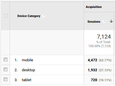
But I had a look in the Google Analytics reports for the site:

Yikes!
So almost 63% of my website visitors are using mobile phones. Add in another 10% using tablets and that’s less than a third of my website visitors using desktop computers.
Here’s the traffic chart showing the growth of mobile traffic over time:

Given that my site was optimised for desktop PCs, it was clear I wasn’t taking the needs of my users into account.
Incidentally, even if your site doesn’t have that many mobile visitors, it’s worth keeping an eye on the trend:

This chart is for the Niche Laboratory website. As you might expect from an SEO tool, it has a far larger portion of desktop traffic. In fact non-mobile/tablet traffic accounts for 92% of traffic to the site (mobile is the orange line, blue is all traffic).
What it basically all comes down to is that generally speaking people CREATE CONTENT on desktops and CONSUME CONTENT on mobiles. So bear this in mind when you’re designing your site or choosing a template.
Even if your site is supposedly mobile friendly, it’s worth checking your stats to make sure mobile users are getting a good experience.
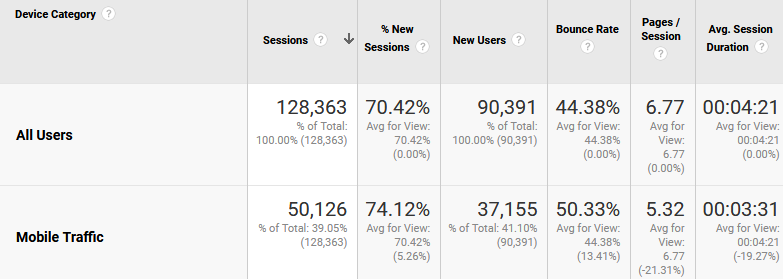
For example these are the stats for a membership site I built:

There are a lot of numbers here but focus on the last two columns.
Bounce rate is around 10% higher for mobile visitors. They also look at around 20% less pages and spend 20% less time on the site.
So clearly I have some work to do to improve the visitor experience for mobile visitors to this site.
Incidentally, tablet visitors seem somewhat more satisfied so it’s clear this is a screen size issue.
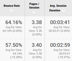
With some care and attention it is possible to improve the user experience for mobile visitors. For example I’ve been building a brand new fully 100% responsive site. It’s early days yet but the mobile user bounce rate is actually lower than the average for all users:

(Mobile is the lower row in this table)
Small Experiment
I’ve now changed the WordPress theme on the site that had a lot of mobile traffic but a non-responsive theme.
I’ll report back in a few weeks or months to let you know how it affected traffic to the site.
How about your own sites? Do you still use a non-responsive theme? And how many % of your visitors are using mobile devices? Leave your observations in the comments section below.


