How SearchEngineJournal Drives Away Readers With These Big Usability Mistakes
Recently I was sent an email containing a link to a potentially interesting blog post about a new Google algorithm update. You can read the article here on SearchEngineJournal if you want.
I didn’t read the article.
Why?
Because of these awful user interface issues. Read on to find out why people like me ARE NOT ACTUALLY READING/BOOKMARKING/RETURNING TO YOUR BLOG.
Annoying Cookie Consent Popup
So I clicked through from my email to the article I was interested in. The first thing I’m met with is a whacking great cookie consent box:

This takes up at least a third of the visible area of the webpage.
I don’t know if I’m alone in doing this but I don’t actually click on these cookie consent buttons anymore. So if the box is big I’ll try and read your blog’s content by doing a whole lot of scrolling.
Actually I lie.
If I see a box like this I’ll click the browser’s back button and visit the next blog in the search results.
That’s death to your blog, because Google now realises there’s a much better blog than yours.
I have seen very little online debate about the effect of the cookie popup. Here’s a discussion about the cookie consent popup effect on bounce rates. There’s also a useful article about how to measure the impact of the cookie popup by using annotations in Google Analytics. There’s more on this website’s own usability issues later on.
Annoying Popup
So I started reading the SearchEngineJournal article then this popped up:
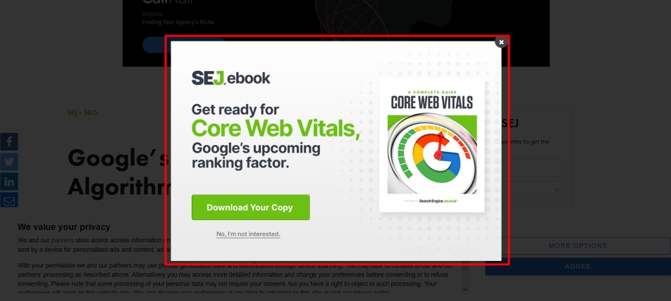
What the heck is this? It’s obscuring the article I am trying to read.
This site repeatedly shows popups – here’s another one:
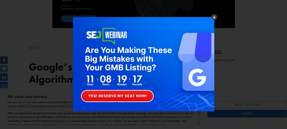
They’re definitely trolling me now…
Tiny ViewPort
When you’re designing your website it’s really important to make it easy for people to read content. In this case I am trying to read the Google algorithm update article. As you can see from the screenshot below, this is *REALLY* difficult:

I’ve put a red box around the article viewable area (viewport). It’s actually 15% of the entire screen. The cookie consent box takes up around 30% of the screen. Another 30% or so is taken up by the big black advert at the top of the screen. The social media sharing buttons are a bit obtrusive and finally there’s a subscribe box that takes up a good portion of the screen.
15% – it’s a good job I have a 24 inch monitor and I’m not trying to read their website on a mobile device or tablet!
Confusing Content
Finally I found their article just too confusing to read:
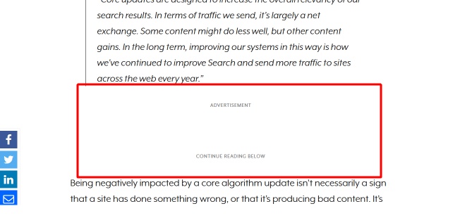
I mean, is that ADVERTISEMENT message showing that the text above is an advert?
Also by the time I’ve read ADVERTISEMENT and CONTINUE READING BELOW I’ve probably forgotten what I had read in the previous paragraph.
Bonus Rant – The Ole Website Bait ‘n’ Switch
While finding some links for the Cookie Consent content above, I visited an article on OptimizeSmart.
Initially I thought this website was much better than SearchEngineJournal. As you can see from the screenshot below it has a much larger viewport for actually reading articles:

However as soon as I started reading the article, IT ACTUALLY DISAPPEARED!!!
This is what the article turned into:
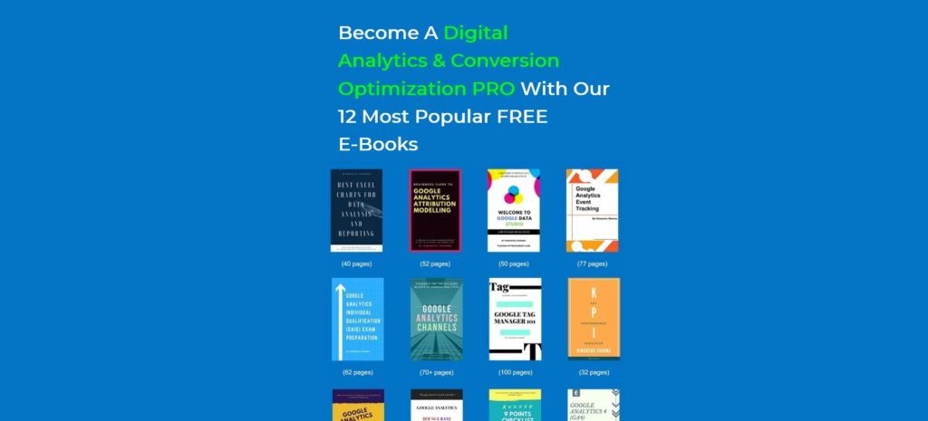
So suddenly I’m at Barnes & Noble. WTF?
I tried clicking on the blue background, but nothing happened.
Then I scrolled down and realised I couldn’t actually see this:
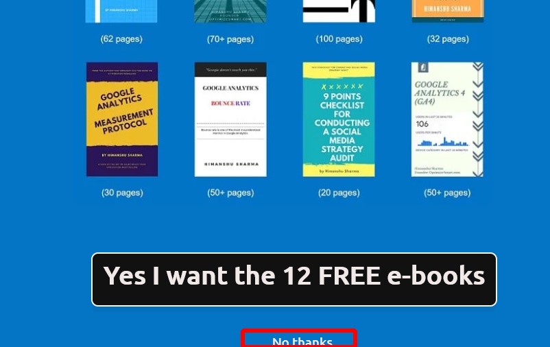
So there is a tiny No thanks to click on, but on my browser window it doesn’t fit in the viewport, and unlike other pop-overs there’s no way to close this one without clicking on No thanks (there’s no X to close it either).
End of Rant
OK so SearchEngineJournal and OptimizeSmart will probably reply that they have millions of visitors and everything’s hunky dory.
For now.
I doubt I’ll ever visit another one of their articles again. Their brands are forever tainted in my opinion, and who reads blogs these days anyway – I’ll probably just watch a YouTube video about the same thing.
Anyway, if you run your own blog and do any of the above, then that’s why your bounce rate is going up, and traffic is going down.

